On the main page below the introductory title, there is a slide show displaying reviews from 3 film/tv critics that I found on the internet. I will be making a separate post dedicated to the research I did to choose these 3 individuals as well as the longer reviews I am developing to be included on the "Press" page on the website. The quotes are just snippets of extended reviews. Below this slideshow is going to be a video which will be the first full episode of the series. I am opting to include it in this post because it has yet to be uploaded (and made in the first place). Following the video will be a square split into 4 smaller squares that serve as inviting links to the main pages:

I am fully embracing the theme of seeds and growth that comes with the title of the piece to create a sense of branding, hence why I chose the images for the first two squares. I obviously had to deviate on the third since I am, in other words, not a plant or a seed! The three first squares send you to the "About" page that includes the three sections listed. This is how that page looks so far without any elaboration in the text:
"The People" square sends you to the "The People" page featured on the main navigation bar which the individuals featured in the first season of the series and their biographies.
This is a small snippet of what that page is going to look like. The other two individuals will be on a different row and their biographies will be below a note that indicates which episode is dedicated to them.

Going back to the main page, below the "link square" will be a note from me that explains the function of the contact box. Here is what it'll look like:
The note indicates that people are free to
share their stories with the producers of this series for a chance to be featured in the next season. This is how the contact option looks like:
The end of each page includes a section called "Representation." This section features the contact information for PR, the Producer, Sales, and Festivals. The contact info offered is an email as well as a phone number. I have yet to create an individual email for the series that will be used for contact info as well as the social media accounts I'll be opening (this includes a Facebook, Twitter, and Youtube channel). Additionally, the section always includes the same social media bar that is present in the main page so the social media is readily accessible on any page. This is what the "Representation" section looks like:
I have already shown you guys the "About" and "The People" pages, therefore I'll be moving away from the main page and onto the other pages. The "Where to Watch" page, as mentioned before, can be accessed through the button on the main page that says "Hear All Their Stories" or through the menu bar. Take a look:

This page includes information for where the series can be streamed and offers buttons that link directly to the subscription pages for the websites listed. As I mentioned in my post about distribution, I would like people to have the option to watch the series in other settings other than the comfort of their own home. I developed an idea similar to that of "13" that offered select screenings in classrooms, where people can request a copy of the series for a special event they want to host. On another note, this is the perfect place to display the poster for the series, considering there is already an image present for the film this template was designed after. I will eventually upload the poster in that slot when it's been digitized.

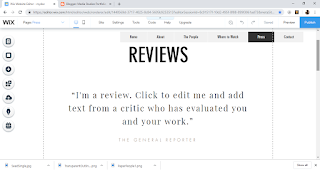
The "Review" page is an extension of the quotes seen on the main page. Each critic will have a longer review here, so the text seen currently will be smaller to fit the paragraph(s). I will also be extending the space between the title and the first review because I'd like to add ratings from different institutions/entities such as Rolling Stone and Rotton Tomatoes. I'll most likely show this updated version when I make a post about the final edition of the website. I feel very confident about my progress with the website because having done a lot of work on it gives me more space and time to focus on perfecting the episode. We'll see how it goes!


No comments:
Post a Comment